VISIT SITE
Here is a selection of Q&As from Your Cheshire and Merseyside Wedding magazine whether it be about flowers, hair and makeup, fashion, wedding themes, health & beauty, cakes, stationery, legal advice. If you would like your question answered by our experts, please email it to editor@yourcheshiremerseyside.wedding
To view more expert advice on a different topic, please select one from the list below.
Showstopping Bakes
| Q | What is tipped in the world of weddings? |
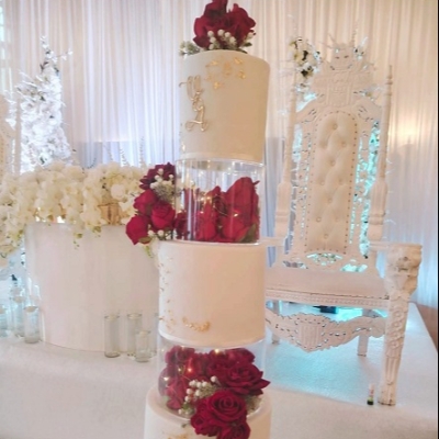
| A | Clare Deary says: The past several years have seen a huge trend in couples ordering a small, single tier cutting cake with a variety of other desserts (such as cupcakes, cookies, and bars) for their guests to choose from. While this is still a lovely dessert option for any wedding, we expect to see clients shift toward ordering large, multi-tiered wedding cakes with more extravagant designs. Larger, more grand wedding celebrations are becoming popular again, and nothing signifies this better than ornate, tiered wedding cakes. These towering showstoppers aren't just for show; they're a fantastic way to incorporate multiple cake flavours, giving guests more variety. For couples planning a big wedding with lots of loved ones, they serve both as décor and dessert, making it as functional as it is beautiful. Floral decorations have always been a wedding cake staple, but 2025 is taking this trend to new heights with intricate sugar florals. These edible works of art are incredibly realistic, often indistinguishable from real flowers, and are perfect for couples looking to bring a touch of nature to their cake. I believe we'll see even more elaborate installations that enhance the cake's presence, turning it into a true centerpiece of the celebration. Expect beautifully styled tables with a cohesive, stunning aesthetic that'll elevate the overall experience and give the cake the attention it deserves. It's about creating a unique moment and it's a really effective way to inject some fun and style into the reception. I think a touch of the 80s style will come back. From pairs of sweet swans and the classic couple standing in a ruffled-tulle heart, 80s-style toppers are crowning cakes once again. Kitschy cakes have been on the rise as trending cake designs for the past couple of years and these classic, vintage additions feel like a darling throwback to the weddings of our parents. In the same vein, tier spacers like the neoclassical columns that propped up the cakes of the '80s will be back in style alongside the aforementioned wedding cake topper trends. |
Clare Deary, Cake On The Lake